Background
This little hilltop was an art test for an Irvine based company. The test brief had a tighter budget than I had given myself during the Dungeon Hallway project. So I felt fortunate that I had given myself that challenge.
Like the hallway I was requested to do a stylized scene with hand painted textures. Since I was given a couple of key concept pieces and a budget I didn't have to do much in coming up with the majority of the idea or constraints. So I started off by getting more reference.
Process and Tools
 With my recent experience hand painting textures my pipeline was refined quite well. Knowing that, for me, Zbrush was not the best tool in getting the painted look I skipped using it all together. Also I decided not to do any sculpting for this project and instead used a post process apps to create normal maps. Finally, Photoshop was used for additional texture work, Maya for creating the meshes, and UDK was the engine.
During this process I did find some disadvantages. After checking the .tga files Mudbox created I noticed the fidelity displayed in Mudbox was higher than the files. Which surprised me because I was under the impression that Mudbox used those same files to display how it looked. In the end this was not a detriment, because I had budgeted the textures sizes well. It is a good thing to remember and know for the future. Since it would be easy to spend to much time on the a texture when it will not all the detail will be displayed in-engine.
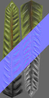
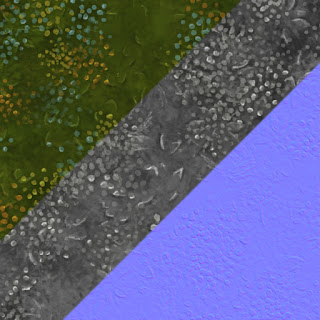
One restriction for the test was a 1K maximum texture size for each ground surfaces; water, rock, and grass. Since, the environment was just large enough I knew a single texture would not have enough variation in it to cover each surface. My solution was to create tiling textures and blend them. This presented me with another disadvantage in hand painting in Mudbox.
 Mudbox can obviously do tiling textures, but I found them a little awkward to create. With time and practice this would be easy to over come, but I was on a tight deadline. Spending time get over this awkwardness instead using a tool I already knew just did not seem practical. For a short time I considered using Zbrush, but as I mentioned my experience with hand painted stylized textures in previous projects with Zbrush deterred me. The solution was use the tried and true Photoshop technique.
Photoshop made creating the tiling textures easy. With the offset filter I was able to see where parts were not seamless and where they were. The only difficulty was when dealing with multiple dependent layers. It was not exactly hard to keep them lined up it just took more time. I had to remember of how many times each layer was offset and how many it needed to be offset again to line up with the other tiles. I was fortunate that this was a non-destructive process so if there was a mistake it was easy to solve with a few more offsets.
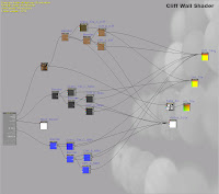
On the technical side the shaders for this project were still fairly simple. The grass/dirt and cliff shaders were basically the same. Both used the vertex color to blend the textures. This worked really with UDK's level of control. Between adjusting the brush falloff and color intensity I was get the texture to do basically whatever I wanted. This is how I add the path from the water to the top of the hill, dirt under the lamp/trees, and varied the levels of flowers in the grass.
 Using multiple tiling textures gave me other opportunities too. For example, there are two 512x512 textures used for the cliff surface which meant I could use another 512 to add more surface variation. To do this I modified the shader to multiply a painted ambient occlusion texture. This was mapped to the second UV set which had no seams and was being used for lighting. It did take a little while to get the values correct, but once it was done it helped increase the painterly feel and add some contrast. A similar technique was used to roughen up the edge of the grass. Instead of an AO it used an alpha.
In previous projects I had noticed that light maps could greatly increase the file size and thus the budget of a level. Based on the brief I knew that the test needed to maintain a low budget. So cutting down memory wherever was a good idea. Until this project I never understood why the individual actor menus had "light map override," but I quickly learned why.
 Basically, that check box lets you micromanage the light map size per in-game asset. One example, of how I used this is the gray rocks. With the project restrictions I decided to make only one rock. When I created the rock I tried to make it different from each angle so it appear as if there were more versions than there are; rotating and scaling helped too. Since I used the asset a lot I knew a large light map would increase the memory footprint. In some places without a real benefit. The light map over ride helped preventing this. Using the override I was able to adjust the map resolution based on rock size. Eventually, I had light maps ranging between 16x16 to 256x256. This same technique was used on the ferns and lilly pads too. In each case the default light map was set to an average size so that the base size did not need modification. Through testing it appeared this cut the light budget by 1/3 to 1/2.
There were a couple of disadvantages. First it took some time to adjusting and testing to get the right maps size, but saving the memory was worth it. The second was a double edge sword. If you copy an asset it retains the settings. Which is great if you do not scale the object. Since I was always changing rock sizes to get the look the way I wanted it meant changing that setting a lot. This was not burdening just I had to remember. If I did not remember to keep the sizes consistent the lighting would look really bad.
Final Thoughts
After turning in the test I got limited feed back from the company. I was told that it was a lot better than most tests, but not exactly what they were looking for. In an attempt to impress upon them my interest and disire to work with them I asked if their Art Director would be willing to give me pointed direction on changes he wanted. Then I would make the changes and turn it back in. My desire was replicate the work environment and show I could take direction and work within their process. Unfortunately, that did not happen. I did hear back from one of there producers. He felt the specular values on the trees were not quite right. Looking back I agree with him. The trees could have used some more work on that map and possible a gloss map.
Another suggestion was from a good friend at Sledgehammer Games. He said I should make the cliff and boulders closer in hue. This makes sense because they would theoretically be from the same geology. Initially, this was not done because the concept piece had two different colors. As a tangent to that I feel the cliff rock could have been painted better. Have more distinct sedimentary layers would have a stronger look. Adding more contrast would not hurt either. Another option would have been adding a 512 as a parallax map to increase the depth.
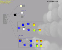
The water shader is another thing that could have used work. My shader was based of a simple online tutorial. It uses a single normal map that pans across itself in two directions. This is used to get the get the rippling and distortion. Granted you can not see them it in these stills. The problem with this shader is it doesn't look great from all angles. If I have future project with water I will look at more tutorials and study Epics water shader much closer. So that they water has more depth and life to it.
This was nice short little project. I wouldn't say I had any extravagant learning from it but it did help me refine my process. I also did learn more tricks about keeping memory budgets lower. I also found that I do enjoying stylized projects a lot more than I thought I would.
This was nice short little project. I wouldn't say I had any extravagant learning from it but it did help me refine my process. I also did learn more tricks about keeping memory budgets lower. I also found that I do enjoying stylized projects a lot more than I thought I would.


Awesome!!
ReplyDelete